Paint and Paint Names
A spectrum analysis
Daniel Harris
I had painted walls only once in my life and was entirely unprepared to tackle the six rooms of the apartment I recently purchased. What began as an exciting project of renovation, a fresh start, a new lease on life, ended as a costly disaster. Tawny Day Lily looked like a drop of golden sunshine on the paint chip, but on the four walls of my bedroom it was a technicolor catastrophe, as was Dark Salmon, a cloying shade of pink, and Candied Yam, a sulfurous yellow that transformed my room into the girlish lair of a cheerleader. Tangerine Dream looked no better in my hallway, and the Citrus Blast of my pantry, when seen in conjunction with the Caramelized Orange of my kitchen, turned my front rooms into a fruit stand.
No one had mentioned to me what many consider a rule of thumb in choosing paint: find a color you like and then select one at least two shades lighter or, better yet, choose another color altogether, preferably white, or, better still, don’t choose and let someone more knowledgeable make the decision for you. When magnified on the wall, a square inch of Pumpkin Patch or Iguana Green becomes several square yards of fluorescent orange and radioactive malachite. The difference between the chips one selects from the “color preview palettes” on display in hardware stores and what one slaps onto the plasterboard is so extreme that the inexperienced homeowner chooses this unequivocally visual product blindly, sight unseen. As tangibly physical as paint is, we are not actually buying a bucket of latex and pigment but a far more fanciful literary product, an evocative name and a piece of paper no bigger than a bookmark, a type of phantasmal paint that we apply not with our brushes but with our imaginations, which rise to the bait of such arresting, yet evanescent, two-word haikus as Bright Laughter, Butterfly Bush, Fleeting Fawn, and Pale Parsnip. Words, however, are a poor substitute for pigment. Strawberry Mousse and Pineapple Delight may be great for the taste buds, but they are hell on the eyes.
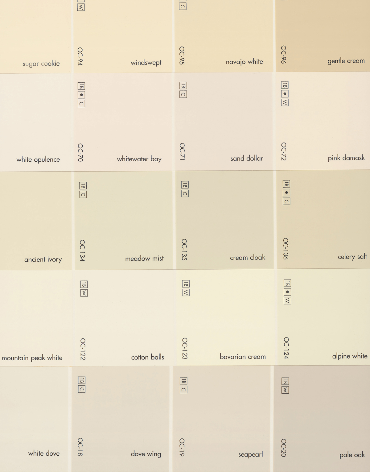
The vast selection of colors available in paint stores (I counted over 50 shades of pink, among them Pink Popsicle, Marshmallow Bunny, and Tickled Pink) complicates the homemaker’s task even further. Although the Inter-Society Color Council recognizes only 267 colors and, moreover, gives them such prosaic names as Reddish Orange, Very Light Green, and Dark Red, Pittsburgh Paint currently offers 1,800 colors and Benjamin Moore no less than 2,000—a mere fraction of the 14,000 the latter has produced since its inception in 1883. Such bewildering variety would challenge the taxonomical skills of even the most ingenious of Linnaeuses who, as it stands, has no tidy Latinate system to make order out of chaos but gives way to despairing giddiness, lapsing into free association. The muse of non-sequiturs inspires him to dream up such marginally descriptive epithets as Splish Splash, Pitter Patter, Golfer’s Tan, Pollination, Salted Shrimp, Old Pickup Truck Blue, Rubber Duckie, and Fuzzy Navel. The absence of established rules also creates nonsensical redundancies and contradictions; Surf Spray for Pratt and Lambert is pale yellow, while California Paint’s Tropical Surf is dark greenish-blue and Benjamin Moore’s Ocean Spray is white-green, just as Mission for Pratt is whitish-beige while Mission for California Paints is blackish-blue.
Before the late 19th century, no primordial paint Adam could christen a wall color a single name because there were no stable paint species. Each professional house painter mixed his colors on the spot by eye (not by a predetermined recipe) and was therefore seldom, if ever, able to reproduce the exact same shade. In 1867, the first ready-made paint was patented, and in 1892, Benjamin Moore brought out a revolutionary powdered paint called Muresco, a kind of instant freeze-dried mix to which one simply added water and stirred. It was an exciting innovation heralded by interior decorators and contractors, even if it was available in an admittedly limited palette (namely, white). Only after World War II, with the rise of home ownership and suburbanization, did the average consumer succumb to the appeal of the do-it-yourself movement and begin to paint his walls himself, without the help of the professional painter. He was thus thrown into an unprecedented intimate relationship with paint manufacturers and retailers which, before World War II, had largely dealt with gruff contractors who knew precisely what they wanted and didn’t need to be seduced by the rhapsodic poetry of paint names. The de-professionalization of painting thus gave birth to a whole new literary genre: the lyrical if infantilized rhetoric with which companies began to captivate the novice, who insisted that paint products have enticing names, not just the numeric formulae printed on each chip.
A spectrum analysis of paint names yields a distinct vision of the consumer. For one, she is female, as can be seen in the preponderance of such stereotypically girlish colors as Ballet Slipper, Pink Fairy, Cinderella, Debutante Pink, Pussy Willow, and Light Chiffon. For another, the divisions between her senses are at best permeable. She perceives the world synesthetically through a euphoric haze, with sight collapsing into taste and touch into smell. She not only sees colors, she hears them (Melodious Mauve, Green Melody), smells them (Citrus Sachet, Patchouli), feels them (Dusty Mink, Soft Satin), and tastes them (Tangy Taffy, Pizza Pie). In order to appeal to the consumer, paint manufacturers create colors that suggest a nearly mystical state of arousal, the sensual tempest stirred up by virtually all contemporary advertisers who sell products by instilling us with a false vision of the body, one afflicted with an almost neurasthenic sensitivity. Paint names quiver with an inexplicably voluptuous agitation, which we are meant to find contagious, so electric that our senses become unstable, clouded by the distortions of hype.
According to this anatomically incorrect vision of a body that responds to the world far more keenly than we really do, the primary organ for experiencing colors is not the optical nerve but the taste bud, which discerns in colors mouth-watering flavors, especially those that cause cavities: Orange Marmalade, Spice Cookie, Crème Brûlée, Toffee Crunch, and Belgian Waffle. Paint names are high in sugar, cholesterol, and empty calories, from Almond Cream and Applesauce Cake to Red Gumball and Lime Meringue. Although we live in an extremely visual culture, the paint-namer is often unable to describe hues without reference to food, whose representation poses far greater challenges to the advertiser, since taste cannot be conveyed through the available media, whereas colors lend themselves to television broadcasts and glossy magazines. Perhaps it is because of the very impossibility of capturing in words the flavor of an apple or, for that matter, of a gin and tonic, that the rhetoric of taste is far more advanced than the rhetoric of color, and the paint manufacturer is forced to piggyback on a more mature commercial language developed by an industry that has had to overcome insurmountable obstacles to entice the consumer, who cannot yet taste the difference between a pixel and a Benday Dot, an audio frequency and a video signal. Perhaps also the ineloquence of publicity departments in the face of the color wheel reveals that a visual culture like ours has never really examined the assumptions that structure its experience of the world, or has come to rely so heavily on images that it has lost the ability to discuss them and has been reduced simply to evoking them, as if the mere act of their presentation were an adequate substitute for their description and analysis. Our eyes may have improved as we abandon words for special effects and computer graphics, but our tongues have become lazy.
Food names are also a convenient disguise for the very opposite of food: for the inedible, for Cobalt 2-Ethylhexanoate, Titanium Dioxide, 2-(2-Butoxyethoxy)-ethanol, and, of course, lead, all of which cause birth defects, cancer, mental retardation, sterility, silicosis, and damage to the liver, lungs, and central nervous system. It is not coincidental that paint manufacturers—the gourmets of scrumptious nomenclature—advise us to use their products in well-ventilated rooms, keep them out of the reach of small children, and seek immediate medical attention if swallowed, ironic precautions for a trade that names colors after things that are expressly designed to be swallowed, even devoured, as well as inhaled like the headiest of perfumes. The transformation of paint into an ersatz beverage, snack, or cologne is a way of banishing the specter of the skull and crossbones, since the ultimate test of a substance’s harmlessness is our ability to ingest it. The spurious connection manufacturers make between the paint can and the dinner plate provides an abstract, literary antidote to a very concrete poison, which seems infinitely less virulent when it is likened, however rhetorically, to a Hot Toddy, a Crisp Won Ton, a Lime Tart, and a Sweet Honeydew Melon.
Toxicity wears another mask, the imaginary ingredient. Colors were once identified by the substances from which they were made: cochineal, a brilliant red pigment produced by pulverizing the bodies of thousands of cochineal insects, (parasites that live on cacti); azure from azurite, a blue copper ore first powdered and then washed in soap, gum, and lye; iris green, made from the sap of iris flowers thickened with alum; and saffron, from the golden yellow spice produced by grinding the dried stigmas of crocus flowers. Now, the paint manufacturer actively conceals the substances from which his colors are made. In fact, virtually no naturally occurring pigments are in use today. With only a handful of exceptions, colors are created in laboratories through the artificial combination of inorganic chemicals fused under abnormally high temperatures. It should come as no surprise that there is no sesame in Sesame, tarragon in Tarragon, or oregano in Oregano, just as there is no okra in Pickled Okra, pineapple in Pineapple Sage, or brandy in Brandied Pears. And yet paint companies still hark back to an age in which names identified a color’s primary ingredient, as if their product line had not been concocted in Pyrex flasks full of toxic catalytic agents bubbling over Bunsen burners, but plucked out of fields (Sunflower, Yellow Begonia), harvested from trees (Fresh Peaches, Honey Maple), or fished out of the ocean (Pale Coral, Tropical Seaweed Green). Paint names are small white lies that suggest the pigment was found, not made, distilled from the leaves of geraniums and the pulp of papayas, a lyrical fib that at once allays consumer fears about toxins and elicits nostalgia for a lost bucolic world.
Whether it is a bundle of palm fronds or a palisade of granite, the wall, which we have decorated for at least 9,000 years, chronicles the history of man’s fight against nature. This protective obstruction was once nature’s enemy, the barrier that sheltered us from elements we simultaneously feared and worshiped. It is now nature’s tombstone, a victory monument that shows how completely we have vanquished our environments, how we no longer fear them but view them instead as a source of recreation and refreshment, a luxurious spa in which to soothe frazzled nerves, a Sylvan Whimsey, a Sunlit Glade, a Sweet Meadow, a Green Pasture. The wall no longer excludes nature but rather brings the out-of-doors inside with us, where we live our lives amidst a color idyll, a pastoral of Prairie Winds, Summer Rains, Woodland Ferns, Spring Tulips, and Green Jungles. The wall is not a barricade but an imaginary window that has eliminated the division between outside and inside and repotted our gardens right in our kitchens and bedrooms, or, perhaps more accurately, built our kitchens and bedrooms smack on top of our flowerbeds.
With the rise of cities, the wall’s real enemy is not nature but other human beings who lead secretive lives on the opposite side, lives that are contiguous with ours but that we seldom see, that make their presence felt only by means of late-night quarrels, the distasteful smells of cooking, creaking box springs, and the constant murmur of flushing toilets. Overcrowding and urbanization have given the wall new meaning. Ever since the first loose stone was piled on top of another, crude partitions have delineated property and thus served as architectural extensions of our sense of identity, a way of saying to our enemies “mine,” a deed of ownership we sign in bricks and mortar. As we are herded together by overpopulation and are forced to abandon the luxury of detached dwellings for small apartments, the architectural ramparts of our identities are besieged by the madding crowd, which would claim its share of the ever-dwindling space available in which to lead lives that have become more and more solitary the closer we live to each other. The poetry of paint names is based on a misanthropic aesthetic, one that pretends that our walls are not communal property, are not shared, that there is nothing behind them but the green sward, wide open spaces devoid of other people, vast horizons of Island Dawns, Arizona Sunsets, Big Skies, Mountain Forests, Pink Mesas, and Burning Sands. Paint provides us with a psychological barrier from our neighbors, a way of achieving a sense of self-containment and allowing our imaginations to revel in that most pressing desideratum of urban life—space, the empty clearings available for a song on the color preview palette.
In the Juicy Fruit world in which we live, our sense of wonder at color has diminished to a state of bored acceptance, the indifference of the chromatically privileged to their wealth. Color meant so much more to us when we lived in black and white rather than a harshly colorized world, when the purple reserved for royalty was painstakingly made from millions of tiny droplets of ink excreted by shellfish, and when blue was produced from lapis lazuli imported at exorbitant cost from Persia, usually in order to paint the now oxidized robes of the Virgin Mary. In fact, ever since the Industrial Revolution made colors commonplace, we not only take color for granted but are somewhat suspicious of it, and associate garish clothing in particular with the “tastelessness” of the proletariat. Before pigment was mass-produced in factories, color was a luxury that only the well-to-do could afford, whereas peasants and workmen were forced to settle for various shades of brown—a color that is, not surprisingly, almost entirely absent from the medieval and early Renaissance painter’s palette. When the common people finally experienced their color liberation, the class associations of the spectrum were reversed, and upper- and middle-class men in particular frowned upon the proletariat’s unbridled experimentation with gaudy jackets and flashy cravats.
When I gasped in horror at the riot of colors that I had so mistakenly created in my rooms, I was in part responding to this snobbish prejudice against vibrant hues, to my undemocratic urge to tone down and mute my color scheme, opting for “tasteful” pastels that never draw attention to themselves, that fade, quite literally, into the woodwork. My fear of making embarrassing gaffes also stems from the association I make between bright colors and the marketplace, which, as Ruskin once libelously said of Whistler, dashes the paint pot in our faces, affronting us with acid-pink awnings and flashing neon signs. We mark the distinction between the public and private world with stark color differences, retreating from the kaleidoscope of dots and pixels that assault us on the streets into the cozy banality of an unassuming palette.
But perhaps our preference for unassuming earth tones has an even deeper psychological origin. Our skittishness before the color excesses of consumerism may suggest a direct, if entirely unconscious, correlation between taste and camouflage, between our love of subdued tones and our fear of predators, our desire to blend into the foliage and become all but invisible. The display of bright colors is a key part of mating rituals, of the dalliances of birds that unfurl flamboyant plumage or lizards that inflate iridescent throats. Only when one is flirting, however, does one risk becoming such an easy target—and then only—in hopes of attracting a very special type of surprise attack, a fatal ambush by Cupid and his arrows. When I balked before the mess I had made of my walls, was I in some dark, forgotten corner of my mind, the reptilian brain that still resides in the swamps from which we emerged, reacting to the way I had violated my self-protective invisibility? Does the evolutionary basis of good taste lie not in self-expression, as we are taught to believe, but in self- negation, self-effacement, the eminently practical desire of the animal to survive in comfort in a lair that even the most sharp-eyed species, a step or two higher on the food chain, would be hard-pressed to spot amid the brambles from which it is deliberately indistinguishable?
Daniel Harris is the author of A Memoir of No One In Particular (Basic Books, 2002). He has also written The Rise and Fall of Gay Culture and Cute, Quaint, Hungry, and Romantic: The Aesthetics of Consumerism.