Colors / Sepia
Picturing nostalgia
Luc Sante
“Colors” is a column in which a writer responds to a specific color assigned by the editors of Cabinet.
The word means “cuttlefish” in Greek. According to the Britannica (eleventh edition), “the ink-sac, immediately upon the capture of the animal, is extracted from the body and speedily dried to prevent putrefaction. The contents are subsequently powdered, dissolved in caustic alkali, and precipitated from the solution by neutralizing with acid.” It is a rich tone on the border between red and brown, although its precise definition has blurred somewhat since the use of cuttlefish ink has languished, so that today it overlaps with such shades as burnt sienna and Venetian red. In photography, where it occurs naturally in one of two dispositions of gold salts in the toning bath—the other tending toward the cyan range—it was long favored because sepia toning converts the silver content to a sulphide, thereby increasing the life of the print. It was also preferred to stark black and white for its warmth and its greater illusion of lifelikeness in the decades before the widespread application of color photography.
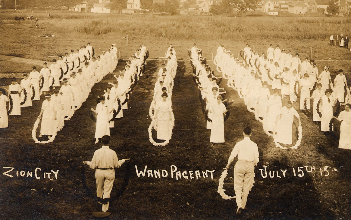
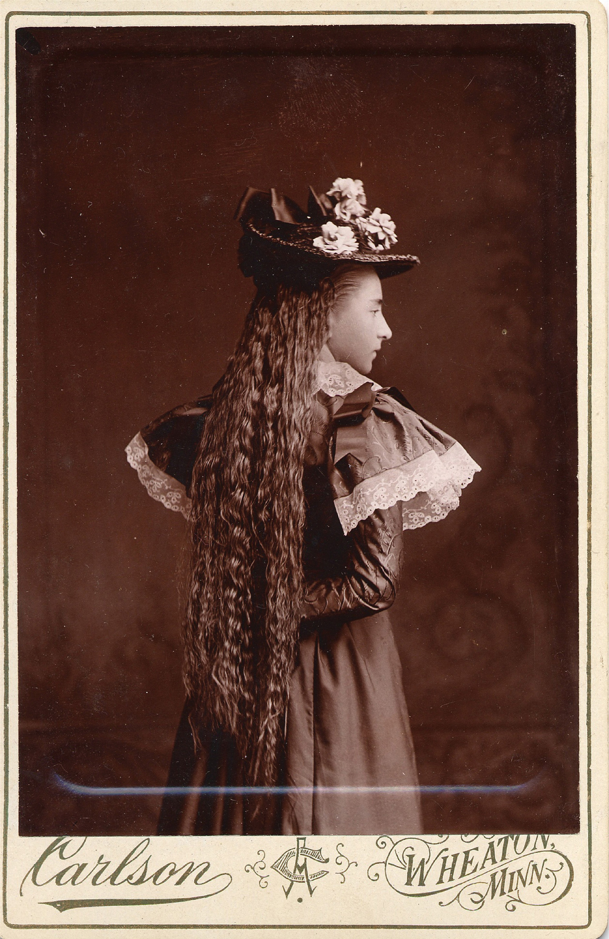
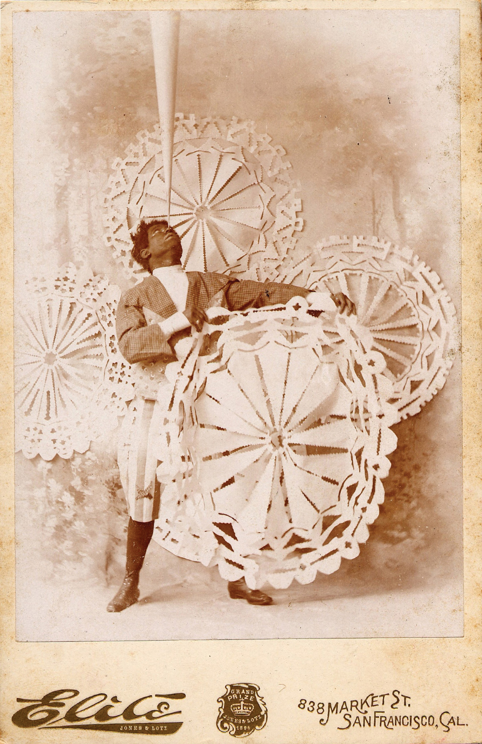
Because of this it has become the color of nostalgia. When you visit Tombstone, Arizona, or Leadville, Colorado, you can dress in one of a variety of replica Old West outfits and have your portrait taken in a simulation of a frontier photo studio; the print will be finished in a particularly ruddy shade of sepia. This same shade was until fairly recently employed to reproduce nineteenth-century photographs in books issued by budget coffee-table publishers, such as Bonanza. A volume on the transcontinental railroad, say, or even a collection of pictures by Timothy O’Sullivan, if published in an inexpensive edition before 1990 or so, was sure to feature muddy plates that were presumably thought to gain in atmosphere what they lost in detail. Today you can convert your recent experiences into thrillingly distant memories by digitally turning color photographs a monochromatic sepia through the agency of Photoshop. For added poignancy you can even give a picture an oval mask and fade out the edges. The photos used in demonstrations of the technique always depict momentous occasions with a predetermined nostalgia factor—the arrival of the new baby—although not the ones associated with ends more than beginnings, such as the retirement party or the golden anniversary, for which sepia would introduce an unwelcome reminder of mortality.
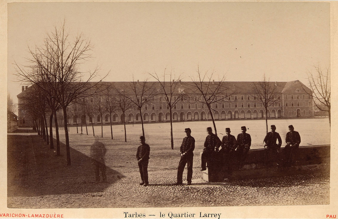
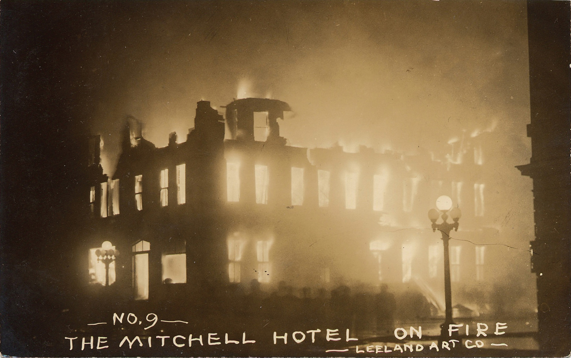
Sepia photographs from the past—from the earliest calotypes by Fox Talbot, circa 1840, up to maybe the third decade of the twentieth century—supply a range of emotional effects as broad as their range of variations on sepia. The many fluctuations in the precise tone of sepia sometimes represent aesthetic choices by the photographer or the printer, but more often have to do with a greater or lesser knowledge of chemistry on the part of these practitioners. The more reddish the tone—the greater its resemblance to contemporary mass-market ideas of the color—the more likely it is that it has resulted from deterioration of the print over time. Sepia in its original state can sometimes be misty, but it can also be steely. It can blur the edges of things in a way that mimics the selective softening of memories over a lifetime, but it can also register and enumerate details with fidelity and penetration, to a degree that beside it black-and-white can appear bloodlessly actuarial and polychrome looks gaudy. Sepia was fortuitously equipped to take on the sensuous and very nearly the tactile qualities of much of the matter represented in the photographs of its period: walnut furniture and flocked wallpaper and velvet draperies and brass fittings and bronze statuary—and bricks and stone, of course.
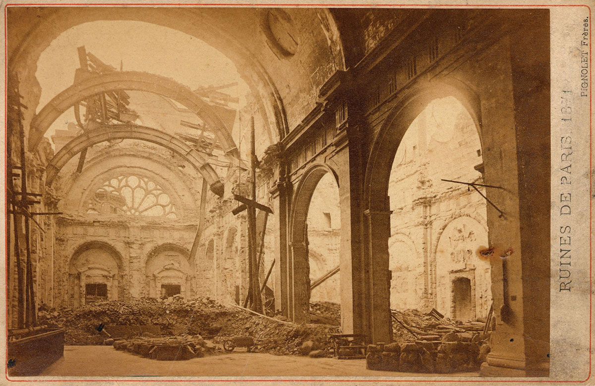
But maybe this was not simply fortuitous. Lewis Mumford entitled his survey of the arts in America between 1865 and 1895 The Brown Decades (1931), and in it he postulated that the period was one of protracted mourning: “The Civil War shook down the blossoms and blasted the promise of spring. The colours of American civilization abruptly changed. By the time the war was over, browns had spread everywhere: mediocre drabs, dingy chocolate browns, sooty browns that merged into black. Autumn had come.” He finds brown in the houses and in the streets, and in painters: the solemn Thomas Eakins inspired by Rembrandt, the mad and indigent Albert Pinkham Ryder concocting pigments from unstable combinations of available substances, ensuring that his pictures would become ever more brown as time passed, not to mention so fragile that many can no longer be exhibited. The overwhelming environmental brown had psychological sources, of course, but it also derived from industrialization, specifically from the vastly increased ambient soot that covered American cities. Brownstone, after all, was not only grand and dignified; it was convenient, since it required cleaning far less often than marble and did not turn black the way most other facades did in the smut-filled coal era. Brown is the color of dirt. It is what results from churning together the entire palette. It is an apt shade for a society that has gone from rustic improvisation to merchant-banker stolidity without an intervening succession of classical and romantic stages. Viewed in this light, sepia fulfills the dual purpose of evoking the flavor of its time and of leavening and retouching its less creditable aspects.
Sepia was thus predestined to be the color of nostalgia, well before the subjects of photographs printed in sepia had become objects of nostalgia. The photographs could evoke those subjects while literally or figuratively camouflaging their pollution, much the way the mind, in recalling a golden age—which is always one’s own childhood, however it is dressed up or relabeled—glosses over difficulties and ambiguities and hardships. Sepia was of course employed in photography around the world, but it has a specific significance in the United States, a youngish country that has not yet lost its empire but is nevertheless as much in thrall to nostalgia as crumbling Russia or expropriated Portugal. Nostalgia in America arises from the continual displacement of its inhabitants, from the slapback effect of ruthlessly accelerated change, from the denial of historical memory and the consequent shallowness of affective ties. America is a moving car, its passengers strapped into their seats, impelled to look forward at distant beckoning lights that may be those of a radiant future but might only be emanating from a parking lot. The past is fog. The parts of it that lap close to living memory can be dismissed without examination as junkyards of defunct ideas and obsolete equipment. Farther back, all that can be distinguished in the haze are shadowy images, tinted by moral reproach.
Sepia colors a world that can be accepted as unfathomably different from our own. If black and white determines for us the tone of the 1930s or the 1950s, when options and fashions and outlooks were ostensibly as clear-cut as they were constricted, then sepia describes a time that is positively alien. Not only did they not have colors then, but they also had no extremes, no midnight or noon. It was perpetually twilight, or possibly late afternoon, and the sun burnished surfaces rather than lighting them up. Sensations were muted. Sounds were hushed. People moved and talked slowly and measuredly. It was an older time than ours, not only chronologically but also in the sense that it was keyed to the rhythms of old age. Our forefathers were already conscious of being our forefathers, even if in their stern, plain virtue they could have no idea of the multicolored, fully wired chaos that was to succeed them a century or so later. We can only think back with wonder and puzzlement, imagining an unbridgeable chasm between the emotions and impulses and desires of that time and those of our own. When we gaze upon the sepia-toned cartes de visite of our ancestors, or of unnamed strangers that have washed up at flea markets, we are flushed with pious sentiments, perhaps, or perhaps feel a mild envy, or maybe without admitting it to ourselves we think we are looking at primitives, if not imbeciles.
When applied to the historical past, nostalgia is merely the obverse of a coin the reverse of which is contempt, since it embodies a refusal of sympathetic imagination. In this dereliction sepia, as a distancing mechanism, is unfortunately implicated. It is sepia’s fate to be so intimately tied to the technology of the past that it has effectively become obsolete. But can this be said of a color? Other colors associated with bygone procedures—verdigris, carmine, indigo—have retained vigor while wearing their antique pedigree with a certain panache. Sepia is of course sufficiently broad in its range to find current employment under various aliases, but its name is shut out. It registers as a dead letter even when context might seem to preclude such a verdict (viz., its use as the title of a long-running African-American news magazine, a genteel analogue to Ebony and Jet; a title so genteel, in fact, that it now sounds embarrassingly apologetic). But then again, a corollary to ignorance of the past is the assumption that the judgment of our own time is final. Maybe sepia and what it implies are simply not old enough to be seen without arousing insecurity about our place in the queue everyone calls “progress.” Maybe the carcass still stinks and the bones have not yet been bleached. But when the wave of digital innovation has crested and been replaced by something else, when the last generation to remember the advent of color in movies and snapshots and television has died out, when the dead weight of nostalgia adheres to the products and customs of our own time, sepia will be freed to look new again.
See press about Luc Sante’s “Colors” column in Serrote.
Luc Sante is general editor of The Library of Larceny and author of Low Life, Evidence, and The Factory of Facts. He teaches writing and the history of photography at Bard College.
Spotted an error? Email us at corrections at cabinetmagazine dot org.
If you’ve enjoyed the free articles that we offer on our site, please consider subscribing to our nonprofit magazine, which includes unlimited access to all our archives.